

U.S. Prescribing Rate Maps
About the Maps
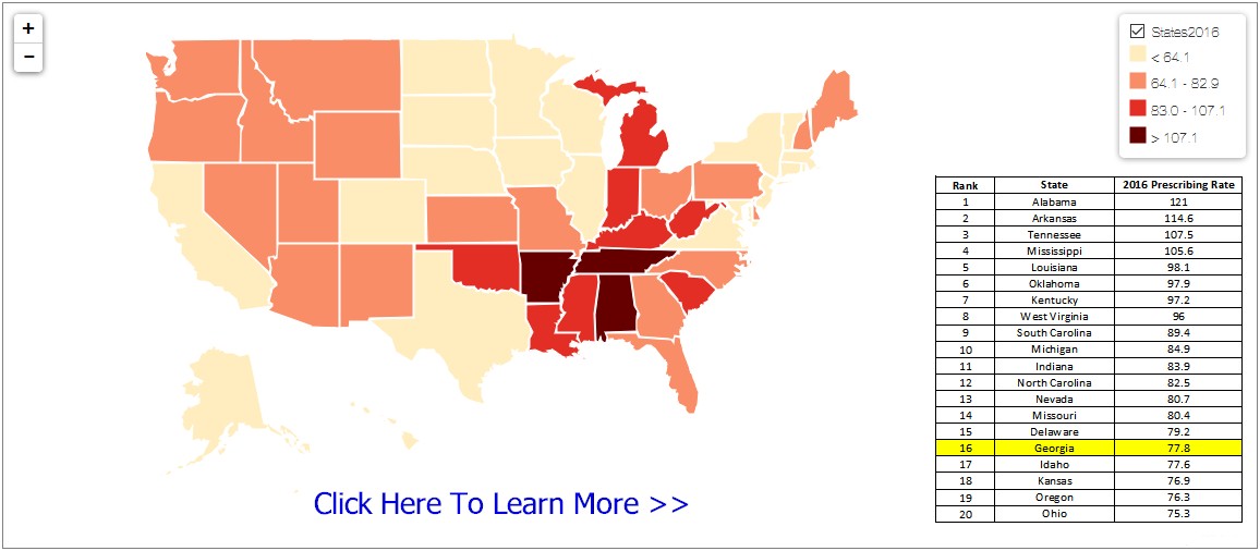
The data in the maps show the geographic distribution in the United States, at both state and county levels, of retail opioid prescriptions dispensed per 100 persons from 2006–2016.
Data are displayed within two types of interactive maps that show the estimated rate of opioid prescriptions per 100 U.S. residents. The state maps portray these rates for each of the 50 states plus the District of Columbia. The county maps portray these rates for 87.6% to 93.4% of U.S. counties for a given year from 2006-2016. Source: www.cdc.gov
U.S. State Prescribing Rate Map
Additional U.S. State Prescribing Rate Maps
U.S. County Prescribing Rate Maps
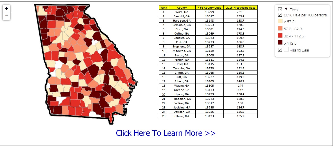
Additional U.S. County Prescribing Rate Maps
Key Highlights
- After a steady increase in the overall national opioid prescribing rate from 2006, the total number of prescriptions dispensed peaked in 2012 at more than 255 million and a prescribing rate of 81.3 prescriptions per 100 persons.
- The overall national opioid prescribing rate declined from 2012 to 2016, and in 2016, the prescribing rate had fallen to the lowest it had been in more than 10 years at 66.5 prescriptions per 100 persons (over 214 million total opioid prescriptions).
- However, in 2016, prescribing rates continue to remain very high in areas across the country.
- In about a quarter of U.S. counties, enough opioid prescriptions were dispensed for every person to have one.
- While the overall opioid prescribing rate in 2016 was 66.5 prescriptions per 100 people, some counties had rates that were seven times higher than that.
- Prescribing rates for opioids vary widely across different states and counties. Emerging hotspot areas are identified by the darker colors on the maps.
Source: www.cdc.gov